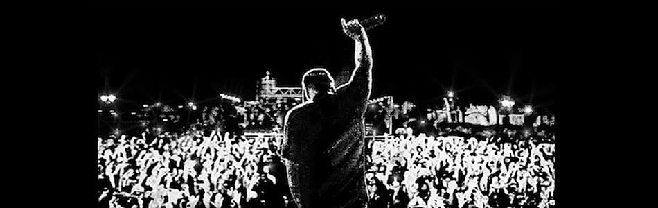
Concertgoers encounter an event’s visual identity long before they hear the first note. They might see an announcement on social media, spot a poster outside a building, or notice their favorite influencer sharing promotional artwork. Those early interactions start shaping their expectations about the experience you’re putting together.
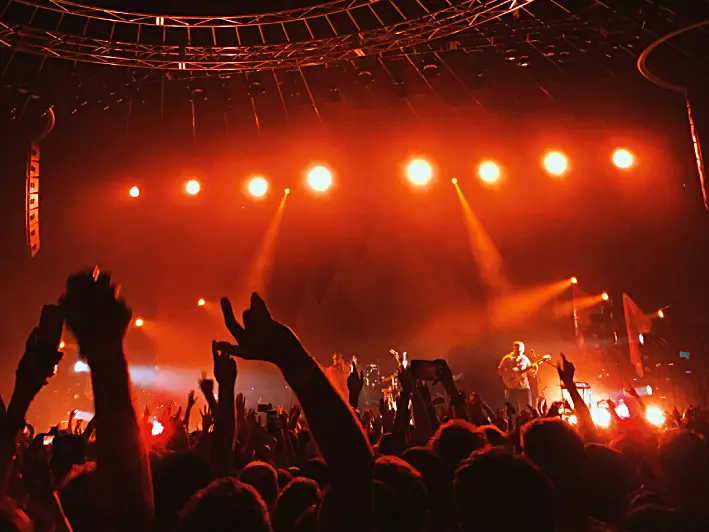
That visual experience continues once they arrive at the venue. Banners, stage graphics, directional signs, merchandise, passes, and concert wristbands can reinforce the look established during your promotional campaign. For example, a sound-activated wristband featuring your logo and colors brings a dynamic flair to your event while ensuring your audience stays engaged with the beat of the music.
So, how can you give your next event a recognizable look without making every piece of material too matchy-matchy? Here are some practical ideas for your next event.
Create a Clear Creative Concept
Before choosing fonts or debating shades of blue, decide what you want the concert to feel like while considering the performers, music genre, venue, and audience. For instance, a summer indie festival benefits from bright colors, playful illustrations, and relaxed typography, while an orchestral performance might call for restrained colors and more formal fonts. Of course, your creative concept doesn’t need to dictate every detail. Instead, it should act as a reference point for the design decisions that follow.
Define Your Color Palette
Color is one of the easiest visual elements for audiences to recognize, so establish your palette early. Choose a few primary colors for prominent applications, along with supporting shades that give your designers room to work. Your event’s colors will eventually appear on things like social posts, tickets, stage screens, and merchandise, so think beyond the main concert poster. After all, a palette that looks fantastic on a laptop may behave differently when printed on fabric or displayed on a massive LED screen.
Establish Your Typography
Fonts showcase different personalities. Serif fonts often feel traditional while sans-serif looks modern. Meanwhile, script fonts are usually fun while decorative ones are attention-grabbing. This means typography is an important part of establishing your concert’s character. You could use a distinctive font for the concert title and artist names while using a simpler typeface for dates, ticket information, venue details, and longer copy.
However, remember that readability still comes first. People shouldn’t have to decipher an elaborate font to figure out where your concert is happening or what time the doors open. Also, test your typography at different sizes and on different backgrounds before applying it widely.
Develop Recognizable Graphic Elements
Graphic elements can amp up your concert’s personality. Depending on your creative direction, these could include illustrations, photography, textures, borders, patterns, icons, or geometric shapes. Your designers should be able to rearrange and adapt these elements according to the format while maintaining a recognizable connection between materials.
Suppose your event uses grainy black-and-white artist portraits paired with bright geometric overlays. Those overlays can appear across posters, social graphics, digital ads, and stage screens without requiring the same composition every time.
Design for Multiple Formats from the Beginning
Concert promotion happens across a huge range of spaces. You may need vertical videos for stories or reels, square social posts, website banners, email graphics, printed posters, digital displays, and physical signage. So, it’s important to plan for those variations before finalizing your main artwork.
For example, visual hierarchy determines what viewers notice first and how easily they can find the information they need. The event name, headline performer, date, and venue typically deserve prominent placement. Meanwhile, supporting acts, ticketing details, age restrictions, and sponsor information can follow at appropriate levels.
That said, remember that a detailed poster or billboard might work beautifully outside a venue but become unreadable as an Instagram thumbnail. So, adjust the scale and hierarchy of information for each format rather than shrinking the original design and hoping for the best.
Carry the Identity into the Venue
The concert itself gives you plenty of opportunities to turn the identity people saw online into reality. Of course, you don’t need to cover every available surface with a logo. The palette, typeface, and pattern are enough to create continuity without making the venue feel overly branded.
For instance, entrance banners can introduce the event immediately, while directional signs and staff lanyards can continue the theme throughout the venue. Stage screens can also bring graphic elements from your promotional materials into the performance space itself.
Give Partners and Team Members Clear Guidelines
A style guide can keep everyone who needs to work with your visual identity on the same page, whether they’re designers, social media teams, printers, venue staff, merchandise suppliers, photographers, and sponsors. The style guide should include your approved logos, colors, fonts, photography treatments, graphic elements, and basic layout rules, along with examples showing both correct applications and common treatments to avoid. It doesn’t have to become a thick branding manual. A few well-organized pages can give collaborators enough direction to produce materials that fit comfortably within the event’s established look.
In particular, sponsor logos, colors, and placement requirements can quickly compete with your event identity if you don’t establish some structure. Your guide can provide clear rules for sponsor placement, such as reserving a consistent section of posters for partner logos. Importantly, discuss these specifications with sponsors before production begins so expectations are clear.
Check Everything Together Before Launch
Individual materials can look great on their own while feeling disconnected when viewed together. Before launching your campaign, gather representative samples and compare them side by side. You might put your poster next to your social graphics, ticket design, wristband mockup, and signage. Every piece shouldn’t look identical. What matters is whether someone could encounter any one of them and reasonably recognize it as part of the same concert.
Give Your Concert a Look Worth Remembering
A consistent visual identity works before the first ticket even goes on sale. In fact, a high-impact identity cuts through marketing clutter, establishes immediate credibility, and turns passive viewers into committed ticket buyers.
words Al Woods