
Art plays a vital role in interior design that goes beyond simple wall decoration. A room’s atmosphere changes completely through artistic expression of feelings. Beautiful artwork adorns many homes, yet their owners struggle with placement. The result often leaves spaces feeling awkward despite quality pieces.

Strategic thinking drives successful art style combinations rather than mere luck. A carefully curated eclectic mix adds depth and personality to make your home distinctly yours. The human eye naturally seeks movement through space at a rhythm that balances excitement and calm. This balance emerges from thoughtful arrangement rather than random placement. A well-defined color palette establishes the mood effectively, and varying orientations between adjacent pieces creates engaging visual interest.
This piece offers solutions to common art placement challenges and techniques to coordinate wall art effectively. You will discover ways to blend different styles while maintaining cohesion. A single striking piece can guide your visual narrative and reshape the scene from a scattered collection into a carefully curated expression of personal style.
Why Some Rooms Feel Off: Common Art Placement Mistakes
Art can create uncomfortable visual experiences even when carefully selected but placed incorrectly. The room might feel off to your guests without them knowing exactly why. You can avoid creating visually confusing spaces by understanding these common mistakes.
Overmatching or underthinking your art
The concept of “matching” art to furniture challenges many homeowners. Perfect coordination usually creates the opposite effect of what’s intended. “Matchy-matchy” rooms often showcase art that blends too seamlessly – safe pieces sharing the same color palette as everything else. These choices result in spaces that lack contrast and visual interest.
Your space needs art that complements rather than perfectly matches your sofa. Art that coordinates too closely with its surroundings becomes invisible and fails to make any statement. While you don’t need to match everything, a unified theme helps your space feel connected.
Ignoring scale and wall proportions
Small artwork above large furniture stands out as a classic interior design mistake. A small painting above a big sofa looks unfinished and throws off the balance. Your artwork should take up about 50-75% of the furniture width below it to achieve proper proportions.
The room’s visual flow suffers when art hangs too high. Your art should sit at eye level, with its center positioned 57-60 inches from the floor. The visual connection stays strong when you leave just 6-12 inches between your furniture top and the artwork’s bottom.
Using the same type of art on every wall
Similar art arrangements on adjacent walls create a competitive yet repetitive feel. Two gallery walls side by side or large paintings facing each other compete for attention without adding diversity.
Your walls lose visual appeal when filled with just one type of artwork – whether photos, paintings, or prints. A mix of photographs, portrait paintings, and three-dimensional pieces adds depth and variety to your space.
Small artworks need proper arrangement to avoid cluttering your walls. Your space becomes more dynamic when you vary the configurations, scale, and orientation between walls.
The Art and Craft of Interior Design: Strategic Placement Tips
Smart art placement can turn a basic collection into a stunning design statement. The right positioning shows off your pieces and creates visual harmony throughout your space.
Vary orientation and size across walls
Your wall’s shape should match your artwork’s orientation to look its best. Wider walls work better with landscape pieces, while narrower spaces suit portrait-oriented art. Two gallery walls next to each other can look repetitive and compete for attention.
Most viewers find art most pleasing when its center hangs 57-60 inches from the floor – about eye level. Dining rooms need a slightly different approach. The pieces should hang lower since people usually view them while seated.
Balance 2D and 3D pieces
Flat art and dimensional pieces create an interesting visual conversation in your space. The wall space should match each piece’s size – a huge canvas might overwhelm a tiny room.
A striking sculpture can serve as your centerpiece with 2D works arranged around it. Smooth paintings paired with textured sculptures add interest without needing to match perfectly. This mix creates natural depth that draws your eye through the space.
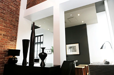
Use mirrors and sculptural art for depth
Mirrors do more than just reflect. They make spaces feel larger, boost light, and create stunning focal points. Placing them across from windows helps spread natural light throughout the room.
Mirrors and sculptures can create amazing visual effects when placed thoughtfully, almost seeming to disappear into the space. Their depth breaks up flat walls and adds architectural interest.
Incorporate furniture to ground smaller art
Large walls can make small art pieces look tiny and lost. Here’s a useful rule: keep 8-12 inches between your furniture’s top and the artwork’s bottom edge. This connects the pieces while keeping proper spacing.
Small works look better in groups – treat the whole arrangement as one piece. You could also display art on shelves or easels at different heights to add depth and dimension.
How to Blend Art Styles Without Losing Cohesion
Beautiful eclectic spaces never happen by accident. You need strategy and expert techniques to create artful chaos in your room that feels both intentional and personal.
Choose a color palette as your guide
Color works best to connect different art styles. Start by picking artwork with shades that match your room colors or build your room’s palette from a piece you love. The 60-30-10 rule works wonders – your primary color should cover 60% of the room, a secondary color 30%, and an accent color 10%. This balance keeps any single shade from dominating the space.
Mix mediums but keep one element consistent
Mixed media shines when different materials play off each other. Great artists use multiple techniques in their work. Your collection can blend paintings, photographs, and three-dimensional pieces. Just make sure one element stays consistent throughout – whether it’s subject matter, color scheme, mood, or presentation style.
Use frames to unify different styles
Your choice of frames can make or break how mixed art styles work together. Frames act as visual bridges between your artwork, furniture and decor. A uniform look comes from consistent framing across all pieces. You could also mix frame styles with purpose – three white frames among black ones create contrast, while a single white frame looks out of place. The right presentation turns your images into collectible pieces.
Let one piece lead the visual story
Start with a striking piece that becomes your focal point. This anchor piece guides your diverse collection and makes your gallery wall pop. Every stunning gallery needs a unifying theme that connects everything. Your theme might be subject matter, color scheme, or even an emotion that builds the foundation of your display.
Let Art Lead the Design: From Inspiration to Execution
Your interior spaces can yield remarkable results when you start with art instead of following traditional design approaches. A piece that resonates with you should guide your room’s entire decor scheme.
Start with a favorite piece and build around it
Personal art choices create spaces that mirror who you are. Designers suggest buying artwork that commemorates special moments in your life. These meaningful pieces deserve prominent spots where you’ll see them every day. Even something as simple as picture-to-paint kits can work if you want to place something with a personal touch – what matters is the personal connection, not the price tag.
A designer placed artwork right across their bed. This artwork became the first thing they saw each morning and connected them to their cherished memories.
Use art to define mood and color scheme
Artwork naturally weaves complex color relationships that guide your palette choices. The dominant hues from your painting help create cohesion throughout the room. Gentle blues and sandy beiges work well for serene spaces. Pieces with vibrant, stimulating colors energize active rooms. The 60-30-10 rule works well – 60% primary color, 30% secondary color, and 10% accent color.
How interior design artwork can shape a room’s identity
Empty spaces transform into customized environments through art. The wall color behind artwork matters: cool walls make warm painting hues pop, while warm walls highlight cool tones. Well-chosen art pieces create visual anchors that set your space’s entire mood.
Conclusion
Art isn’t filler, it’s the heartbeat of your space. Too many people hang beautiful pieces without intention, and the result is a room that feels “off” without anyone knowing why. The fix isn’t more art, it’s smarter placement. Scale, proportion, and orientation matter as much as the artwork itself. Get those wrong, and even the best collection looks awkward.
The real magic happens when you combine strategy with personality. A single anchor piece can drive your color scheme, guide your furniture choices, and shape the mood of the entire room. From there, mix sizes, orientations, and even mediums to create rhythm and depth. Variety keeps a space alive, while subtle cohesion prevents chaos.
The truth is, great design doesn’t come from “matching” – it comes from curating. Trust these principles, then let your eye lead. When art reflects you and is placed with intention, your home stops looking staged and starts feeling unforgettable.


