
words Alexa Wang
Creating an effective and educational poster can be a challenge. Just like with any poster design, in an academic setting, you still need to grab and hold the viewer’s attention. Yet, there are some guidelines one should stick to.
With the right design tips and an educational poster template from you can create a visual that is both informative and appealing. Here are some key design tips to help get you started:
Don’t: Overcrowd the Poster with Information
Text is an important part of getting information across, but pictures should also be used whenever possible. Visuals such as diagrams, charts, graphs, photographs, and icons can all help illustrate points more clearly than just words alone.
Besides, overcrowding your poster with too much information will make it difficult for people to understand the main point or message that you are trying to communicate. Instead, focus on one or two key points and then use visuals to help explain them further.

Also, take the time to find high-quality images or graphics. These will give your overall design more credibility and value while helping people understand the topic at hand.
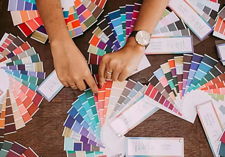
Do: Use Colors to Highlight Important Points
Color can be a great way to draw attention to specific parts of your poster and make it easier for viewers to understand its content. For example, choose colors that stand out and contrast well with each other in order to emphasize important points. Also, think about using a color palette that goes with the overall theme of your poster so that everything fits together.
Do: Organize the Content On the Image
It’s important to take time when organizing all of the elements on your educational poster in order for it to look professional and polished. Try breaking up large chunks of text into smaller sections using headings or bullet points so viewers can easily find what they need without having to search too much through large blocks of text.
Also, make sure that all images are placed correctly under their headings so that readers know where to look for more information about them if they need to.
Do: Add Tables and Charts If Necessary
When presenting data or complicated ideas, tables and charts are especially helpful because they make it easier for people to understand the information at a glance. Tables can also be used for organizing content on your poster and making sure everything is displayed properly so viewers can easily follow along with what’s being said or presented on the image.
Do: Choose a Clear and Easy-to-Read Font
Choosing a font is one of the most important parts of making a good educational poster because it affects how easy it is for people to read the information quickly without having trouble understanding it because the font is too small or too hard to read. Choose a clean font that stands out from the rest of your design so viewers don’t have to guess what your image means.
Don’t: Use Bright And Vibrant Colors
It may seem counterintuitive, but bright colors such as reds, oranges, or yellows should be avoided when creating an educational poster since these colors tend to distract from its content rather than draw attention towards it in a good way like darker colors do.
You can try to incorporate some bright colors to highlight parts of your design. But keep in mind that too many vibrant colors might make some parts of your image look garish, which could take away from its professionalism; stick with subtle shades instead.
Do: Proofread and Fact-Check the Content
Lastly, always proofread and check facts before you print your poster or put it online. This will help you avoid mistakes like typos or wrong facts that could make it hard for people to understand your message.
Bottom Line
In conclusion, making a good educational poster requires planning and thought so that it looks professional and still gets the message across. Keep these design tips in mind next time you’re considering making one yourself; from choosing appropriate colors and font styles all the way down to organizing its content properly, leveraging these guidelines will ensure that your educational posters come out looking great!


