
When you start in watercolor, build your palette is an exercise a little vague. We advance at random, we buy boxes of 9, 12 colors watercolor ready but with half that does not necessarily fit us.
We do not really know what will happen. Intuitively, we go to godets because we say that the watercolor is necessarily in the form of the bucket. We do not really understand the difference between fine and extra fine … short questions, disappointments, risks, money not necessarily well spent…
Do you remember anything?
Me too, I went there: what color? Tube or bucket? What brand? What type of pallet?
In this second article on watercolor colors, I bring you the technical knowledge to know about the color watercolor and pigments to choose well. I also help you build your own watercolor palette but you must have the best watercolor palette for painting.
Your own palette: a unique palette that resembles you.
Why? Because the choice of colors is something personal. These same colors will be part of your artistic style and make you identifiable.
This article is part of a 3-part folder about watercolors:
- Understanding the colors (1/3)
- Build your palette (2/3)
- Know how to use colors (3/3)
Characteristics of watercolor colors
To choose the watercolor colors, here are some technical information to know. How is watercolor made? What are the codes and other small logos on the buckets and tubes? What is the difference between a bucket and a tube? So many little things to know and that will help you find your way.
How is watercolor made?
It is interesting to understand the process of making watercolor paint. Each brand does its own cooking and uses particular ingredients. Some are more ecological than others; others guarantee more resistance over time.
I invite you to take a closer look at the brand you use: understanding their ingredients and their manufacturing process will help you better understand the product you have in your hands.
Watercolor consists of 3 elements: pigment, gum arabic and plasticizer.
- The pigment: this is the main ingredient. He gives the color of the painting. It can be of plant, mineral or synthetic origin.
- Gum arabic: it is a resin that allows fixing the color once dry. With the pigment, the two ingredients are ground very finely to become powder and give a mixture that is diluted with water.
- The plasticizer: it is an adjuvant that brings additional properties to watercolor. There are several types of softeners: honey, ox gall, or glycerine. Each has its own properties. For example, honey enhances colors and is an excellent natural preservative. The ox gall, it will facilitate the dilution of the pigment in contact with water and adhesion to papers having a smooth texture.
The 3 ingredients are crushed, mixed, pressed and placed in a bucket or tub to give watercolor.
Fine vs. Superfine
The main difference between fine watercolor and extra-fine watercolor comes from the sheer volume of pigment and the fineness of grinding. Extra-fine is better than beautiful and more expensive.
This notion is more pronounced in acrylic to my knowledge and the price differences are notorious. It seems less noticeable for watercolor, but in general, for this medium, I advise you to use extra-fine.
Name of the pigments and signage
Not all brands use the same way of naming watercolors or signage, but here are some of the most common things you can find.
The name of the pigments
Generally, pigments can be named in three different ways:
- The name of the pigment itself: Cadmium Yellow, Cobalt Blue, Green Chrome Oxide …
- A generic name: Payne Gray, Water Green, Hooker Green …
- The color associated with the brand of the manufacturer: Blue Sennelier (red phthalo), Yellow Sennelier Dark, Dark Windsor Red …
Color code
Each watercolor color has a particular code that is indicated on the tubes or buckets. The main interest, in my opinion, is the possibility of seeing if the color you buy is “pure” or obtained by mixing.
The code used consists of the letter “P” indicating pigment (synthetic pigment) or the letter “N” stating natural (pigment of natural origin), a second letter is indicating the color and a number.
The second letter covers the following colors:
- R = R ed – Red, pink, some purple, some brown
- O = O range – orange, some orangey browns
- Y = Y ellow – yellow, orangey-yellow
- G = G re – green, greenish-yellow, some turquoises
- B = B read – blue, turquoise
- V = V iolet – purple, purplish blue, some roses
- Br = Br own – brown, some yellow
- Bk = B lake k – black and gray
- W = W hite (white)
Examples:
- Yellow aureole = PY40 -> pure
- Cobalt blue = PB28 -> pure
- Gold quinacridone = PR206, PV19, PY150 -> mixture
When for a watercolor color, you see several pigment codes ( gold quinacridone, for example): this means that the hue obtained is a mixture of several existing pigments.
For these colors obtained via a mixture of pigments, be careful if you want to make new mixtures with. They can turn on the dull faster.
Do some tests beforehand, so you do not have any nasty surprises.
Light resistance
… or the degree of permanence.
The light resistance is a feature not to be overlooked especially if you plan to sell your watercolors. The light and the temperatures act in time on the used paper as well as the pigments.
These, according to their resistance, can move: in general, they become duller, lose in brightness and saturation.
When buying watercolor pigments, several codes may be used depending on the brand. To my knowledge, I have for the moment identified 2:
The ASTM index:
- I = excellent fastness to light
- II = Good lightfastness
Namely: ASTM International is a standardization body and the use of its standards is voluntary. All brands do not use this index and the transparency of the criteria is to be checked …
Other code:
- AA = extremely permanent
- A = permanent
- B = moderately durable
When you make a beautiful watercolor, the last thing you want is to see the colors disappear after a few years. It’s not just about protecting the paint from too aggressive light sources or extreme temperatures.
I strongly advise you to inquire about this point vis-à-vis the brands, or even perform your own tests with control strips. A shelter, an exposed, and see after several months how the pigments turn.
Opacity
The opacity of color in watercolor is essential. Watercolor is a transparent painting playing with the white paper from which it draws its light; this criterion in the choice of your colors is to be taken into account.
When buying your pigments, here are the signs that you can find indicating the opacity of the color:

Opaque / “O”

Semi-opaque / “T / O”

Transparent / “T”
To check yourself the opacity and value of your color: take a tube of watercolor and observe the paint at the exit of the tube. You will already have a good indication of its value.
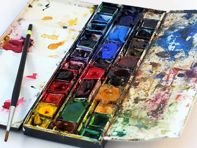
Tube or bucket?
The bucket
The bucket or ½ bucket is a small rectangular container in which the watercolor paste has been arranged and pressed according to industrial processes. Simply wet the surface of the bucket with a wet brush to grasp the pigments and either mix them on the pallet or apply them directly to the paper.
- Its advantage: it is easily transportable. The bucket fits into a box and becomes usable quickly and easily.
- Its disadvantage: It is not possible to charge a lot of its brush in pigment, not great for large surfaces or for those who like to gouache and saturate their watercolors.
In conclusion, the bucket is generally recommended for outdoor practice, on small surfaces or for sketches: ideal for travel books, for example!
The tube
The watercolor, historically, is packaged in a tube: the painting once ready is inserted with the spatula in the tubes and can be preserved for a long time. The paste is unctuous at the outlet of the tube and easy to dilute. Perfect for blending on a palette and also strongly loading the brushes with pigment.
- Its advantage: top for large surfaces to paint, mixtures between colors.
- Its disadvantage: not great for outdoor use, requires more equipment or ingenuity to manage the practice (pallet, tube, risk of waste …).
In conclusion, the use of the tubes makes it possible to paint easily on large surfaces in the workshop, to test mixtures and to play on the saturation of the colors.
Build your palette
Building your palette is a process that evolves. When we start, we grope, we buy the first samples, we test, we complete. Each will proceed according to his tastes, his desires, but also the type of painted subjects.
A watercolorist like Jacques Willie, who makes mainly provincial landscapes, will not have the same palette as an artist like Cate Parr, who creates portraits.
Your colors are you.
The majority of watercolor artists I have met are identifiable, beyond their style of features, shapes, or their subjects, through the colors they use.
On which criteria to choose a color?
You can choose its watercolor colors according to various criteria, including some “techniques” that will allow you to evaluate the usefulness of color and what place it can take in your palette. Other criteria, which I will call subjective, will enable us to have a choice that corresponds to us individually.
Technical criteria
These technical criteria help to choose but also to know the colors that will come to build your palette. By having this knowledge, you will use your pigments better.
1 / Transparency: what is the level of transparency of the chosen watercolor? Does she show the paper? Is it bright?
This criterion can be evaluated thanks to the exercise that I showed you above on the opacity. The more opaque color is, the less bright it will be, i.e. the white of the paper.
2 / The value: what is its intensity between light and dark?
A small example of a comparison between a halo and indigo.
The value scale of the yellow halo is lower than for indigo. Indigo at the source has a solid value that is close to black, which is not the case with the yellow halide.
3 / The saturation: the color is it bright or rather dull?
As for value, this is one of the criteria in Munsell’s color chart. There, your own tastes come into play and this criterion will allow you to evaluate the colors, especially between different brands and depending on the rendering you want.
Recently, a watercolorist has made comparisons of chromatic circles between different brands. This gives an idea of the level of saturation. Some brands like Maimeri Blu or Pébéo seem to offer a range of duller compared to others like Gold Mission or Isaro that appear very saturated.
Note: The type of paper you use can also influence color rendering. I advise you to perform this kind of test by yourself to be able to appreciate their rendering to the real. If the scans are not correctly calibrated, it is difficult to have an exact idea of the color in the digital version.
4 / Unctuousness: This is the sensation and quality of the paste in contact with the brush and its ease in being diluted in water.
I was able to observe differences between the Winsor & Newton I used in my early days and the Sennelier. For the first time, the dough has become less creamy and dilutes less well in the water. This creaminess also varies according to the pigments.
5 / Resistance to light: In time, does the pigment resist?
I spoke to you above. This criterion is essential, mainly if you sell your watercolors. It is a guarantee of credibility and quality with your customers.
The subjective criteria
1 / Your tastes
Criteria are indispensable! I met amateur artists beginner in watercolor and who had never asked the question of the choice of colors according to their desires and their tastes.
Often, we start by wishing to approach reality, so we let ourselves be imposed our colors by the subject that we want more reproduce than interpret.
I invite you to distance yourself from it and reflect on the colors you really like.
Who said that the sky was blue, that the grass was green?
Painting has the advantage of giving us the ability to interpret more than to reproduce.
Do you like variations of blue or do you prefer warm colors? Create a palette that looks like you and decline there with colors in harmony.
You will create watercolors with your colors.
Use colors that you like will also help you progress. You will take more pleasure and you know what they say: it is fun that we learn. Yes Yes. For real
2 / Your subjects
If you are not sure which shades you prefer, your subjects can influence the choice of your watercolor colors. If you paint landscapes, the palette representing the Caribbean islands will be different from that representing the Scottish countryside.
Here too, your personal tastes come into play: what kind of subject do you really like to paint? Still lifes? Landscapes? The portraits? From the abstract? All at the same time?
Take time to compose with topics that affect you and help you choose your colors and discover them.
3 / The harmony between your colors
Once your favorite watercolors are established, complete your palette by choosing others that will be in harmony with the main ones.
Also, test their harmony by creating your own color wheel.
A tool like Adobe can help you and give you a perspective on which colors to choose. Be careful, he will not do the work for you either
A palette in motion
Over time and your experience, you will notice that your palette will evolve, shrink or expand.
At first, I had a large palette that contained more than twenty colors. Whenever I was in a Fine Arts store, I brought back new tubes to test with me. A great moment of joy. I varied the pigments used according to my subjects and my desires.
Very quickly, I realized that I particularly liked certain colors that were recurrent and others that I used more and more rarely.
Today, I have 5 pallets including 2 fixed. The biggest is my beginnings and this multitude of colors in which I drowned with research and pleasure.
On a regular basis, I almost only use a small palette that combines 12 colors. I know them well. I also know the mixtures between them and the hues I can get.
But I’m not completely satisfied yet and I know it will continue to evolve over time.
Occasionally, I create other palettes for a particular subject or color tests and compose accordingly.
There is no rule on the number of colors that will come to build your palette to you. This will vary according to your desires, your subjects and your experience.
See it as an adventure that will enrich you over time and allow you to approach your ideal palette.
And you?
How do you proceed to choose your colors and build your own palette? Has this changed over time? Do you have favorite colors that dominate?
Share your experience with us in the comments.
